Café Joyeux
Project type: Brand Strategy, Rebrand, Packaging Design
Café Joyeux is a local coffee bean roaster and café serving up drinks and treats to guests.
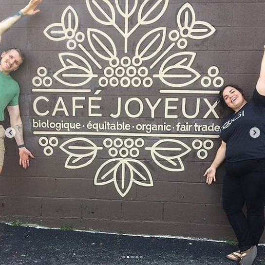
My relationship with Café Joyeux began in a transitional period in my career. I was expanding my service offerings and was developing my hand lettering and illustration skills. My services began with hand lettering projects for their indoor and outdoor signage as well as an outdoor hand painted mural.

But as months of conversation continued, we couldn't help but turn to their brand strategy and logo. At the time, their brand was very complicated with a lot of botanical wispy illustrations. It did not match the overall look and feel of the café and their product did not stand out on a shelf.
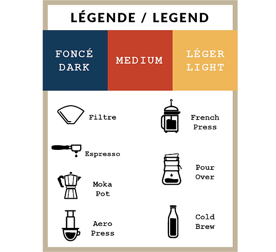
Color palette was important to establish for the client and primary red was first followed by a jean blue and lemon yellow. The combo of the sans serif font and mono-line illustration of the coffee plant and beans was designed to simplify what was a complicated logo.