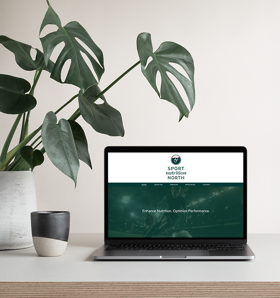
Sport Nutrition North
Project type: Brand Strategy, Rebrand, Website Redesign
Sport Nutrition North is an Ottawa-based Registered Dietitian practice helping athletes fuel for peak performance in a healthy, sustainable way.
The owner was looking for a feminine, powerful, down-to-earth brand that appeals to her ideal client. She was looking to appeal to a specific client base and needed some clarity and consistency around her brand. After some brand strategy sessions, we started with a rebrand.

The master logo is an icon paired with a modern and clean sans-serif font and is intentional and brand specific. The colour palette includes a specific green to northern Ontario forests with other jewel tones and the additions of taupe and peach.

The background includes the full color palette chosen specifically to display a natural, down-to-earth and feminine look and feel. The northern Ontario forest landscape honors the owner's ancestry. Second, the inner icon symbolizes a deconstructed heart to symbolize health, and an italicized ‘S’ and ‘N’ for ‘Sport Nutrition’, stylized with a sport forward feel. Some added badges were created for use on shirts and hoodies. The website naturally followed - Sport Nutrition North